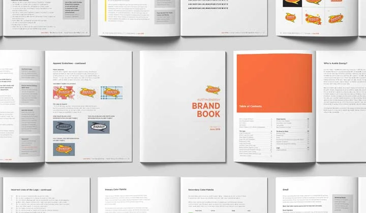
AUSTIN ENERGY BRAND BOOK
PROBLEM/CHALLENGE
Austin Energy is a publicly owned utility providing electrical power to the city of Austin, Texas and surrounding areas. Established in 1895, the company is infiltrated into the community. They are community owned, and thus, provide more than a private company would offer; they provide more than electricity. They offer energy efficiency rebate and incentive programs, renewable energy options, educational outreach and more to their patrons.
Yet despite their longevity and reach, Austin Energy is practically unknown to many of their 440,000 customers. Even more so, the main identity associations that seem to stick are negative connotations with bills, government and electrical outages. This is significant in that positive contributions to their customers and to the community are often overshadowed and/or negated.
The bottom line is, if deregulation ever occurred, Austin Energy could not be confident that their customers would understand the full value that they provide over private industry in a free market.
OBJECTIVE
At the heart of Austin Energy’s issues is the fact that they have no discernable brand and no brand guidelines. This means they have no road map to help tell their story so it’s doubtful that they are telling a solid and consistent story. This doesn’t work. Austin Energy needs to establish the necessary framework that would allow them to build a unified and identifiable presence moving forward.
APPROACH
As lead designer on brand, I pulled from the company’s mission, vision and values statements and drove the creation of phase 1 of the Austin Energy refresh, a 40 page brand book. I lead the project, built and managed the schedule, wrote 85% of the content, edited the copy and designed the book while mentoring/collaborating with a junior graphic designer. Afterwards, I presented to executives and other parties to relay the new brand direction throughout the utility. Additionally, in winter 2018, I will co-present several two-hour lunch and learn programs during the Austin Energy Corporate Learning Week. In the meantime, I continue to act as creative director as we move Austin Energy into further iterative stages of brand formation.
FEATURED BRAND BOOK CONTENT
Color Palette
We reigned in the previous range of colors used while also being mindful of existing programs that had an established presence in the community. Hues for the new color palette were selected based on existing collateral and color testing.
Business Cards
I designed the new business cards for the brand refresh. The version seen above is simple, but design was furthered challenged due to the flexibility needed to provide cards for 13,000+ employees at different locations with different information needs.
Typography
As with color, type has been consistently inconsistent at Austin Energy. Gotham and Gotham Narrow were chosen as the corporate typefaces moving forward. They are new and fresh yet well established and credible at the same time.
Lockups
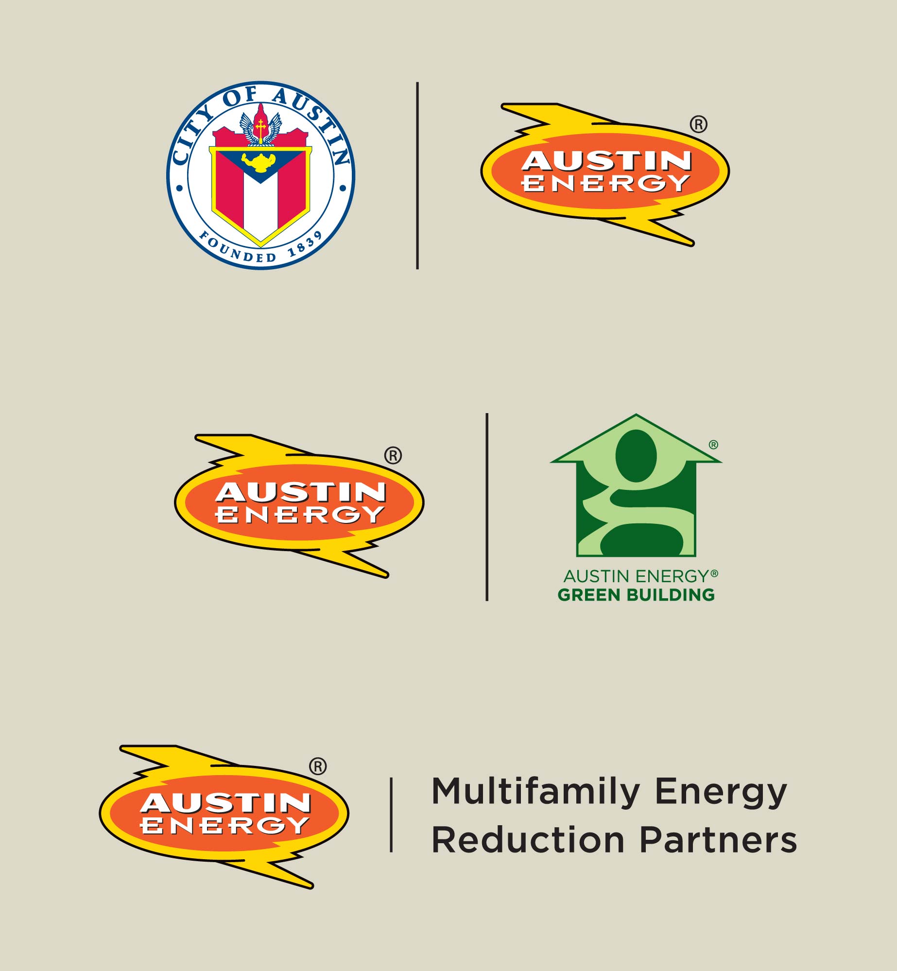
In the past, it seemed that every Austin Energy program had its own logo. With this brand refresh, I designed lockups to replace nearly all stray logos for a more streamlined and consistent brand.
PHASE 2 AND BEYOND
While Phase 1 touched on more of the basics, Phase 2 of the brand refresh will dive deeper into the tone and visual identity. Specifically, I will define photography and illustration styles, I will provide templates for some of our popular collateral pieces and I will present a more comprehensive guide to promotional items. Phase 2 will also introduce updated iconography and approved corporate patterns.


